Roofing Website Examples: Two Builds Analyzed Through the Conversion Lens
By PRH Web · Updated May 22, 2026
Most articles on this topic are listicles of screenshots with no analysis. This post walks through two roofing websites built for different markets — and what separates one that converts from one that just looks fine.
Most articles on this topic are listicles. Ten screenshots, a sentence each, no real analysis. They tell you the design looks clean. They don't tell you whether the site would actually turn a homeowner into a call.
This post takes a different angle. Two roofing websites, walked through with one question in mind: would a homeowner with an active roof problem end up calling this company? That's the only question that matters. Design choices either serve that or they don't.
A note on the examples below: both are PRH Web demo builds, not real client case studies. They use realistic roofing-company positioning — owner backstory, service area, trust signals, process structure — to show how different markets require completely different website decisions. I'm not going to screenshot competitors' sites without permission, and most listicle posts that do are wrong about what's working anyway. What you're getting instead is two builds I can walk through honestly because I made every decision in them.
What you're actually evaluating
A roofing website has one job: move a visitor from "can this company help me" to "I should call them now." Everything else — colors, fonts, copy length, hero photography — only matters if it serves that job.
Five questions worth asking about any roofing site:
- Is it immediately clear what they do and where they work?
- Can a homeowner reach them in under ten seconds?
- Does the site show real work or generic stock?
- Is the inspection or quote process explained before the ask?
- Does it load fast and work on a phone?
A site that gets all five right has a much better chance of converting than one that doesn't, regardless of how it looks.
Two examples, two markets
Pickens Roofing — storm damage and insurance claims
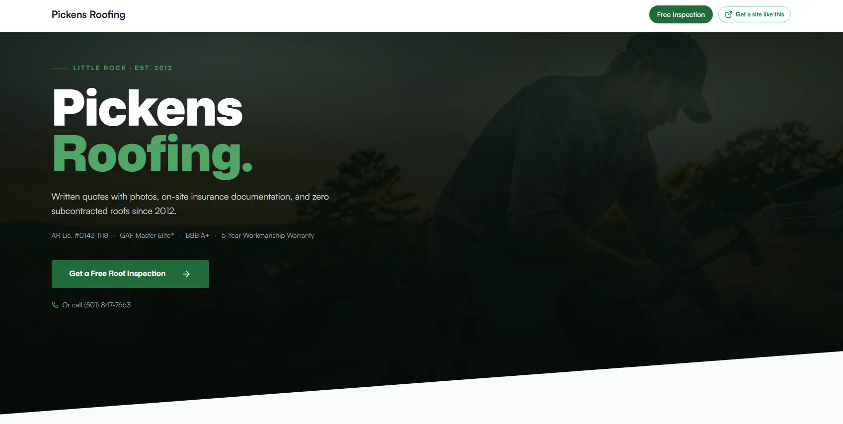
The Pickens demo is a single-page lead-gen site built for the storm and insurance-claim market. The central credibility move is an owner story built around prior carrier-side adjuster experience: ten years on the insurance side, independent since 2012. The on-page pitch says it directly — "I started Pickens to be the contractor I'd have wanted to refer my own claimants to."
That's not a generic "family-owned since 1985" claim. It pre-resolves the biggest fear a homeowner has when filing a storm claim — that the contractor will fight their insurer badly, overbill, or fail to coordinate the claim. The origin story isn't decoration. It's the conversion engine. In a real client build for an insurance-focused roofer, you'd substitute whatever genuine credibility lever they actually have.
Around that, the site does the rest of the job: the process is laid out (inspection → documentation → claim coordination → repair), the phone number is tappable from the first screen, the form is short, and the insurance work has before/after proof. Everything on the page either reinforces the credibility or shortens the path to contact. There's no "About" navigation, no blog, no portfolio carousel. One page, one job.
The build matches the buyer's mental state. Storm-damage homeowners aren't comparing eight roofers. They want to know whether this contractor can handle their carrier, and they want to call.
What this example does well
- Leads with the buyer's actual fear (will the contractor handle the carrier properly)
- Puts tappable phone access on the first screen
- Explains the inspection and claim process before asking for the lead
- Avoids distracting navigation on an emergency-intent page
Cedarline Roofing — premium replacement in the Texas Hill Country
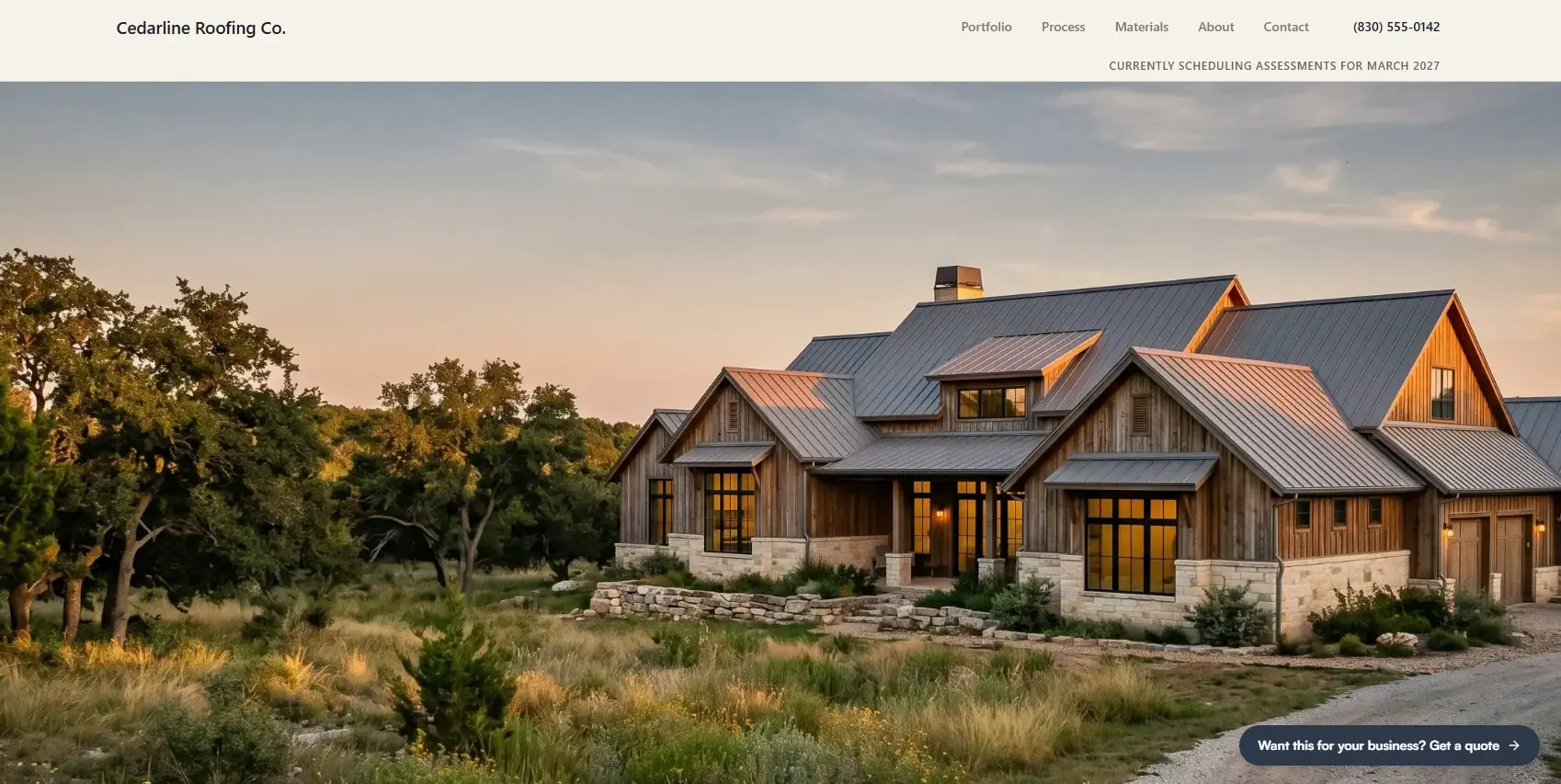
The Cedarline demo is a multi-page site for the premium-replacement market. Completely different buyer, completely different site.
The homepage opens with "Roofing in the Texas Hill Country since 1981" and immediately names the service area: Boerne, Fredericksburg, Kerrville, Comfort, Wimberley, Dripping Springs, Bandera. A premium-replacement buyer in that region either lives in one of those towns or knows them. The geographic specificity earns trust before the visitor reads anything else.
The trust structure is built around the kind of manufacturer credentials a premium-replacement buyer would actually look for — top-tier programs like GAF Master Elite or CertainTeed Select ShingleMaster. In a real client build, you'd surface whichever credentials the roofer actually holds. The point is that generic "certified roofer" language wouldn't land at this price point. Specific recognized credentials do.
That proof layer matters because your website and your Google Business Profile do different trust jobs; see roofing website vs. Google Business Profile.
The site is structured around five pages — Portfolio, Process, Materials, About, Contact — and each has a job. Portfolio is proof of comparable work. Process removes hesitation about what a multi-week replacement actually looks like. Materials gives the buyer enough technical detail to feel informed before they request an assessment.
The conversion ask isn't "get a quote." It's an assessment request. That matches how someone spending $30k+ on a roof actually decides — they don't shop quotes. They invite the contractor out to inspect, and the contractor either earns the job or doesn't.
What this example does well
- Names the exact service geography in the first screen
- Uses recognized premium credentials instead of generic claims
- Separates proof, process, materials, and contact into distinct pages
- Frames the ask as an "assessment" rather than a "free quote" to match a higher-ticket sale
The principles are the same across both sites: clear positioning, low-friction contact, specific trust signals, process clarity, mobile-first execution. The expression is completely different because the buyer is.
What a screenshot can't tell you
This is where listicle posts on this topic break down. A screenshot can show you the layout. It can't show you any of the things that actually determine whether a site converts.
Mobile load speed is invisible in a screenshot. A site that loads in 1.2 seconds on desktop WiFi can take 8 seconds on mobile data — and most roofing searches are on phones. Homeowners don't wait.
Form friction is invisible. Does the form autofill on mobile? Does it ask for zip code AND address AND phone AND email AND service type before letting the visitor submit? Where do submissions actually go? How fast does someone respond?
Tappable phone behavior is invisible. The screenshot shows a phone number on the page. It can't tell you whether tapping it opens the dialer or whether the visitor has to copy and paste.
Post-submit clarity is invisible. Does the confirmation say "we'll call within 24 hours to schedule" or just "thanks for your submission"? The first reduces ghosting. The second invites it.
Whether trust signals are real on closer look is invisible. Does the certification badge link out to the cert body's site? Are the project photos actually the company's work? A screenshot can't tell you. A homeowner ready to call can.
Any post that ranks the "best roofing websites" using nothing but screenshots is guessing.
Patterns that signal a roofing site won't convert
Four patterns I see repeatedly on roofing sites that are bleeding both paid traffic and organic visitors:
- Homepage built for browsing, not converting. Services, about, gallery, testimonials, blog — all weighted equally, no clear path to a call.
- Generic photography. Stock images of suburban houses, or low-quality phone photos that don't match the company's stated tier.
- No process clarity. Form labeled "Get a Free Quote" with no explanation of what happens after submission. Homeowners assume the worst and bounce.
- Desktop-first builds. Sites that look fine on a 27-inch monitor and break down on a phone screen where most emergency searches happen.
Each of these is a thinking failure, not a budget failure. A roofer with a $500 freelancer site can avoid all four if the freelancer thought about the buyer. A roofer with a $15,000 agency site can hit all four if the agency didn't.
Testing your own site
The fastest way to evaluate a roofing site is the test from the Google Ads post: open it on your phone, set a timer, and check whether the basic questions — what they do, how to reach them, what happens after the form — are answerable in the first twenty seconds without scrolling. If not, the site is the problem, not the marketing channel feeding it.
For the demos above: Pickens is the single-page lead-gen version PRH Web sells at $700 flat. Cedarline is the multi-page version starting at $1,500+. Both are walkthroughs of what those tiers actually deliver. Full pricing is on the pricing page.
For the actual timeline behind these builds, see how long a roofing website takes to build.
Send me your current roofing site and I'll review it through the same lens used above — what's converting, what's leaking, and what would change in a rebuild. No obligation.